
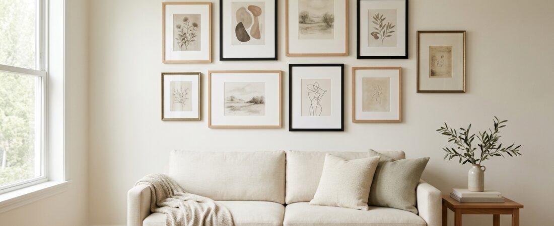
There is a particular kind of decorating frustration that happens when you start shopping for affordable gallery wall frames: you know the wall needs something, but every attempt to fill it somehow makes the room feel less finished instead of more.
You save art you love. You find a few affordable frames. Maybe you add another print because the wall still feels empty.
And suddenly the gallery wall you imagined as collected and elevated starts to feel random.
The problem may not be that you need better art—or more expensive frames.
You may need a better frame plan.
Affordable gallery wall frames can look surprisingly polished when the entire group works together. Size, proportion, matting, finish, repetition, spacing, and construction often matter more than what each frame costs.
So before you buy another frame, use this guide to decide what your wall actually needs—and where your decorating budget will make the biggest difference.
TheHomeCurate approach: Affordable doesn’t have to mean choosing the lowest-priced frame you can find. It means creating the finished-wall effect you want without paying custom-framing prices—and knowing where spending a little more can actually improve the result.
This post may contain affiliate links. If you click through and make a purchase, I may earn a small commission at no extra cost to you. Read our full Affiliate Disclosure for details.
Before You Buy Another Frame, Decide What Your Wall Actually Needs
A gallery wall is not automatically the right answer to every blank wall.
Sometimes one over sized piece of art—or a pair of larger coordinating frames—will look calmer, more substantial, and more intentional than eight smaller pieces trying to fill the same space.
Before shopping, ask yourself:
Do I actually want a gallery wall, or do I simply want this wall to feel finished?
A gallery wall makes the most sense when you want to display a collection: family photographs, printable art, vintage-inspired pieces, illustrations, travel memories, children’s artwork, or a mixture of things that tell a visual story.
One or two larger frames may be the better choice when the wall needs a strong focal point, the room already contains several competing elements, or you prefer a quieter look.
That distinction matters for your budget, too.
Buying more inexpensive frames is not necessarily less expensive—or more beautiful—than buying fewer frames that are better suited to the wall.
Start with the finished effect. Then decide how many frames it actually requires.
Step 1: Choose the Gallery-Wall Look Before You Choose the Frames
One of the easiest ways to end up with a gallery wall that feels random is to shop frame by frame without first deciding what visual language connects them.
You don’t need every frame to be identical. You do need a reason they belong together.
Here are five useful directions to consider.
Structured and matching
Matching frames are the simplest route to a clean, cohesive gallery wall.
Use one finish—such as black, natural wood, or white—and let different artwork provide the variation.
This works especially well if you like minimalist, contemporary, or orderly spaces, or if you’re nervous about mixing finishes.
Collected and mixed
A mixed gallery wall feels more layered and developed over time.
The trick is controlled variation.
Rather than choosing five unrelated frame styles, repeat something across the composition: a dominant finish, similar mat color, recurring wood tone, or consistent frame profile.
Your frames can differ without feeling accidental.
Warm and organic
Natural and warm wood frames soften a wall and work particularly well with landscapes, botanical prints, neutral photography, sketches, and earthy artwork.
They can also keep a gallery wall from feeling too graphic or formal.
Graphic and black
Black frames create strong visual boundaries and make it relatively easy to combine different types of art.
If you love the artwork but don’t trust yourself to coordinate several frame finishes, black is one of the simplest ways to establish consistency.
Vintage-accented
Gold, brass-look, carved, or vintage-inspired frames can give a gallery wall the character that inexpensive matching sets sometimes lack.
But you don’t necessarily need an entire wall of ornate frames.
A small number of distinctive frames mixed into a simpler foundation can provide enough contrast to make the whole arrangement feel more collected.
The goal isn’t perfect matching. It’s visual logic.
Step 2: Decide How Many Frames You Actually Need
There isn’t one correct number of frames for a gallery wall.
The right number depends on the wall, furniture beneath it, frame sizes, and how much visual activity you want.
Instead of beginning with a rule, think in terms of scale.
For a compact gallery
A grouping of roughly 3–5 frames can be enough for a narrow wall, small apartment, hallway, reading corner, or space above a compact piece of furniture.
Using fewer frames also gives each piece more visual importance.
For a medium gallery
Around 5–8 frames can create enough variation to feel collected while still being manageable.
This is often a useful starting range if you want to combine a few sizes without covering an entire wall.
For a larger gallery
A fuller arrangement might use 8 or more pieces, but this is where planning becomes especially important.
As the number of frames increases, consistent spacing, repeated proportions, and a dominant finish become more useful for preventing the wall from feeling chaotic.
These are starting points, not formulas.
Five substantial frames can occupy more visual space than ten tiny ones. The wall itself—not an arbitrary frame count—should make the final decision.
Step 3: Choose Frame Sizes That Make Future Changes Easier
Affordable frames become much more useful when you can keep using them after you change the artwork.
That is one reason standard sizes are worth prioritizing.
Common frame and print dimensions are generally easier to pair with photographs, downloadable art, replacement mats, and future prints than unusual proprietary dimensions.
But there is one important detail to understand before ordering:
Artwork size, mat opening, frame size, and the frame’s outside dimensions are not necessarily the same thing.
For example, a frame sold as 11 × 14 may hold an 11 × 14 piece without a mat but display a smaller image when its included mat is used.
Meanwhile, the actual outside edge of the frame will be larger still.
That difference matters when you’re planning several frames to fit within a limited wall area.
Also check the aspect ratio of your artwork before buying. A rectangular print won’t necessarily fit another rectangular frame without cropping simply because the measurements look close.
Before checkout, confirm:
- the artwork dimensions
- the frame opening
- the mat opening, if included
- the frame’s outside dimensions
- portrait or landscape compatibility
That small check can prevent one of the most frustrating gallery-wall mistakes: buying a collection of frames only to discover that your artwork doesn’t fit the way you expected.
Step 4: Should Gallery Wall Frames Match?
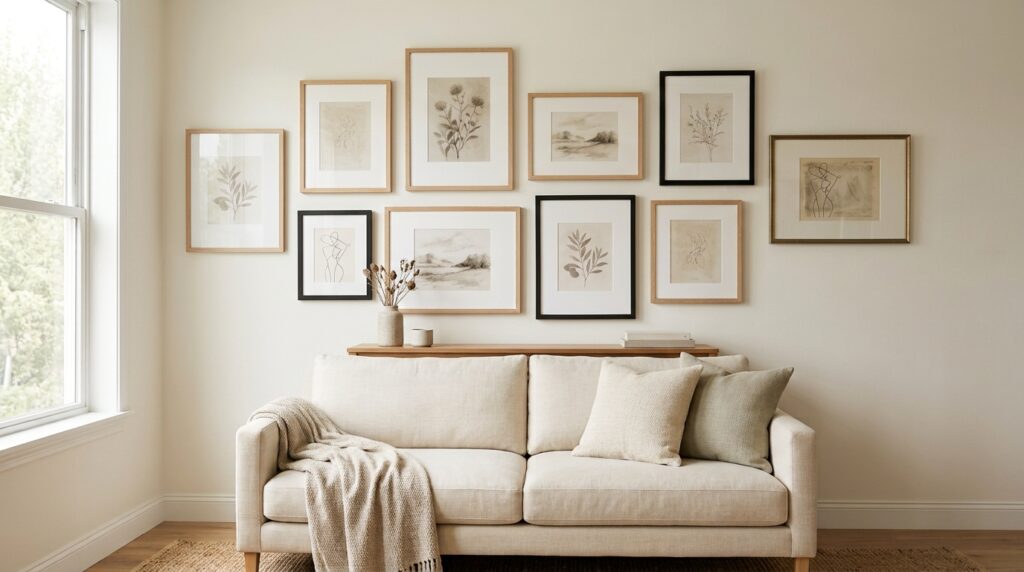
No—gallery wall frames do not have to match.
But completely random frames are harder to make look intentional.
If you want the easiest, lowest-risk option, matching frames create immediate repetition. This is especially useful when your art already contains many colors, subjects, or styles.
If you prefer the collected look, choose a dominant frame finish and introduce variation around it.
For example:
- mostly natural wood with a few black accents
- mostly black with one or two warm wood frames
- warm wood plus a restrained gold accent
- one consistent frame color with different widths and sizes
The exact ratio matters less than making one visual idea clearly dominant.
If every frame introduces a new color, material, thickness, ornament, and mat treatment, your eye has nowhere to settle.
Instead, repeat enough elements that the differences look deliberate.
Matching creates cohesion through repetition. Mixing creates cohesion through restraint.
Both can look expensive.
Randomness is what usually undermines the effect.
Step 5: Pick a Finish That Supports the Room
Frame color should not be chosen in isolation.
Look at the finishes already present in the room: furniture, lighting, curtain rods, hardware, flooring, and the artwork itself.
Then decide whether your frames should blend with those elements or add contrast.
Black frames
Black is crisp, graphic, and versatile.
It can anchor colorful art, black-and-white photography, line drawings, or mixed print styles and is particularly useful when you want several inexpensive frames to read as one visual system.
Natural or light wood
Natural wood feels softer and warmer.
It works beautifully in warm minimalist, Scandinavian-inspired, organic-modern, boho, and relaxed neutral interiors.
Just pay attention to undertones. One “natural” wood may lean yellow while another looks gray or pink.
Walnut and medium wood tones
Darker wood brings more richness and can suit cozy, traditional, vintage-inspired, or modern-traditional rooms.
It can also bridge a gallery wall to darker furniture elsewhere in the room.
White frames
White frames visually recede, which can be useful when you want the artwork rather than the framing to dominate.
They can work particularly well against colored walls or with bright, airy artwork.
Gold and vintage-inspired frames
Gold adds warmth, contrast, and personality.
For an affordable gallery wall, consider using it as punctuation rather than assuming every frame needs to be gold.
One distinctive frame among simpler wood or black pieces can sometimes create more character than an entire matching set.
Step 6: Why Mats Can Make Affordable Frames Look More Elevated
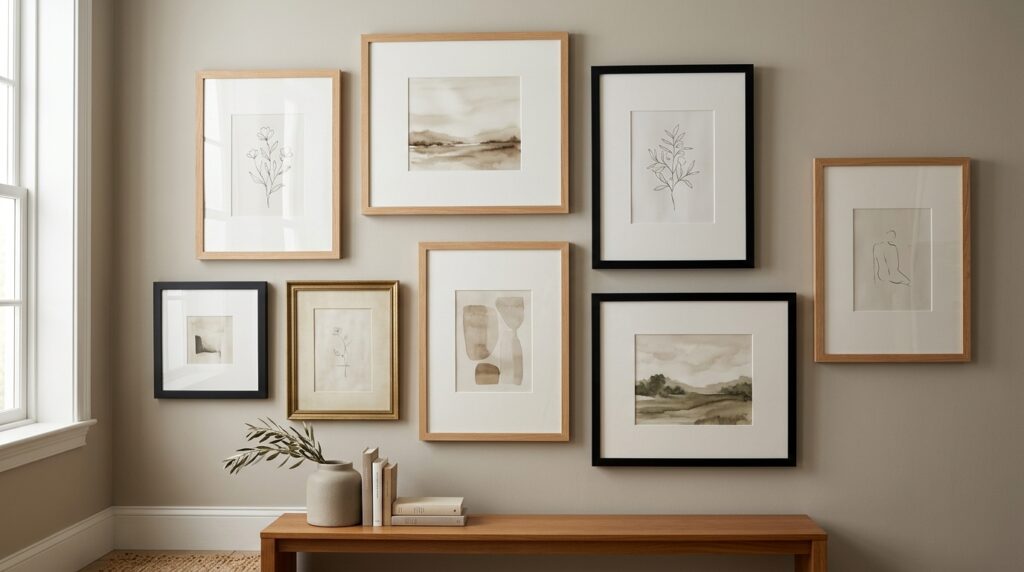
If you’re deciding between spending more on an elaborate frame or choosing a simpler frame with a good mat, don’t underestimate the mat.
A mat creates breathing room between the artwork and the frame.
That extra negative space can make a small or inexpensive print feel more considered, and it helps prevent a busy gallery wall from becoming visually cramped.
Mats can also make standard frames more flexible.
A larger frame with a mat may display a smaller artwork today, while removing or replacing the mat could allow you to use a different piece later.
When comparing affordable gallery wall frames, check whether mats are included and—more importantly—what size the mat opening actually is.
A frame advertised for one size of artwork may display another size when the mat is inserted.
This is one place where reading the dimensions carefully can matter more than paying more for the frame itself.
Step 7: Choose the Right Frame Construction for Your Situation
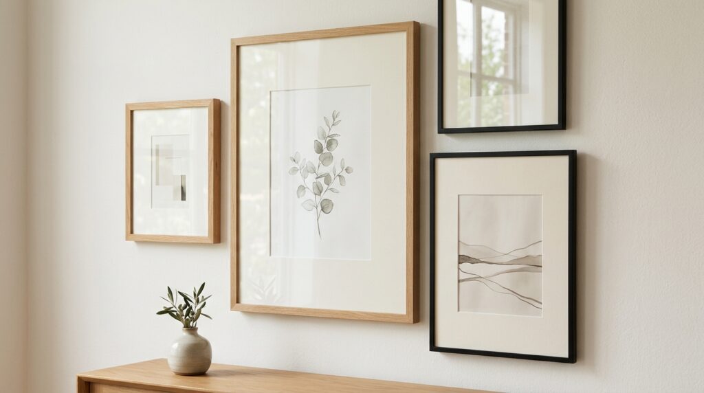
Two frames that look almost identical online can behave very differently once they’re on your wall.
Look beyond the finish and consider the construction.
Glass vs. acrylic or plastic fronts
Glass can feel substantial and provides a traditional framed presentation, but it also adds weight and can break.
Acrylic or other plastic fronts are generally lighter and may be useful where frame weight or breakage is a concern.
However, material quality varies. Acrylic should not automatically be assumed to be scratch-proof, glare-free, or suitable for every location.
Backing
Check how the back is constructed and how easily it opens.
A frame you plan to reuse for seasonal art, children’s artwork, photographs, or printable art becomes much more practical when changing the contents isn’t a struggle.
Hanging hardware
Check whether the frame includes hanging hardware, what orientation it supports, and whether that hardware works with your intended installation method.
This matters especially for renters.
A lightweight frame may give you more mounting options, but lightweight does not automatically mean damage-free.
If you’re considering removable mounting products, check the frame weight, manufacturer’s instructions and weight limits, wall texture, paint condition, and your lease requirements before installation.
The goal is to reduce unnecessary risk—not promise that any one mounting method works safely on every wall.
Step 8: Know Where Budget Frames Tend to Look Cheap
Price alone doesn’t determine whether a frame will look inexpensive.
Small construction and finish details often make the bigger difference.
When evaluating affordable picture frames, look carefully for:
Poorly aligned corners
Corners and joins are visually prominent, particularly on black, wood-look, and metallic frames.
Uneven joins can make the entire frame appear less finished.
Weak or warped backing
A backing board that doesn’t sit properly can affect how the artwork rests inside the frame and how securely everything stays in place.
Poor front material
Cloudiness, scratches, excessive distortion, or damage can distract from the artwork regardless of how attractive the frame itself is.
Inconsistent finishes
This is particularly important with multi-packs.
If you’re buying several frames specifically to create repetition, noticeable variation in color or finish can undermine the reason you chose a set.
Confusing dimensions
Always determine whether the listed measurement refers to the artwork, opening, mat, or outside frame.
A bargain isn’t a bargain if it doesn’t fit your art.
Inadequate hanging hardware
The cheapest frame isn’t necessarily the best value if you immediately need to replace hardware or mounting components to use it properly.
The better question is not simply:
“How cheap is this frame?”
It is:
“How much usable, finished-wall value am I getting from it?”
Step 9: Know What Is Worth Paying More For
You do not need premium frames everywhere to create an elevated gallery wall.
But there are places where spending a little more—or simply choosing more carefully—can improve the finished result.
Useful mats
Included mats can increase flexibility and make inexpensive prints feel more substantial.
Reliable standard sizing
Standard dimensions make it easier to change artwork later instead of replacing the entire frame.
Better finish consistency
This matters especially when several frames will sit next to one another.
Practical backing and hardware
If a frame is difficult to open, difficult to hang, or poorly suited to repeated art changes, the lowest purchase price may not represent the best long-term value.
Reusability
A neutral frame you can move between rooms and refill with different art may ultimately be more useful than a highly specific frame you love for one particular print.
Lower replacement risk
Construction matters.
Replacing a frame because the backing, front material, hardware, or finish doesn’t hold up can erase the savings from choosing the cheapest option in the first place.
Think about the cost of the finished wall, not just the sticker price of each frame.
Which Type of Affordable Gallery Wall Frames Is Right for You?
Once you know the look you want, choosing a frame category becomes much easier.
| Choose this type | When it makes sense |
|---|---|
| Multi-pack frame set | You want the simplest cohesive starting point and a lower cost per frame. |
| Matted frames | You want a polished presentation and more flexibility between artwork sizes. |
| Black frames | You want a straightforward route to visual consistency. |
| Natural or warm wood | You want the gallery wall to feel softer, warmer, and more organic. |
| Lightweight or acrylic-front frames | Weight or breakage is an important consideration for your room, household, or rental. |
| Mixed frames | You want a collected look and feel comfortable coordinating controlled variation. |
| Vintage or gold accents | You want to add character and contrast without making every frame ornate. |
| Large-format frames | Your big blank wall may look better with one or two substantial pieces instead of a full gallery. |
You can also combine categories.
A gallery wall might use mostly affordable natural-wood frames, several with white mats, plus one vintage-inspired gold accent.
The category helps you shop.
The system is what makes the wall look intentional.
Plan the Whole Gallery Wall Before You Buy or Hang
This is the step that can save the most frustration.
Don’t build the wall one impulse purchase at a time.
Before buying the full set—or putting holes or adhesive on the wall—plan the entire composition.
Confirm:
- how many frames you’re using
- the approximate outside dimensions of each frame
- portrait versus landscape orientation
- your dominant finish
- whether mats will be consistent or intentionally varied
- which piece will visually anchor the arrangement
- your intended mounting method
- any wall, lease, furniture, child, or pet considerations
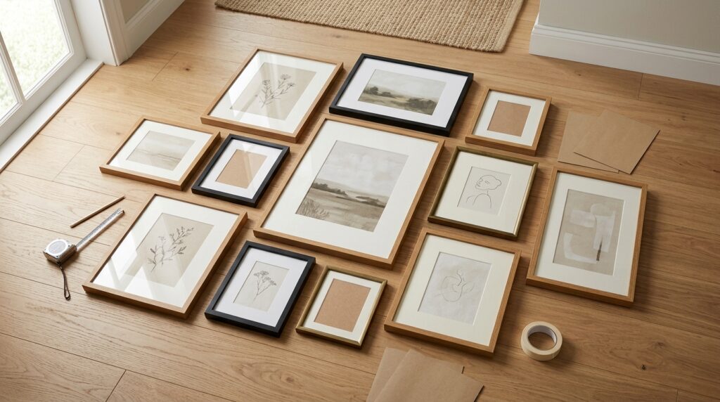
Then lay out the arrangement before installation.
You can arrange the frames on the floor, use paper templates, or map the composition another way that lets you see the full shape before committing it to the wall.
This is also where you may discover that you don’t need the last two frames sitting in your shopping cart.
Or that the arrangement needs one larger piece instead of three small ones.
Or that the mixed-frame gallery you planned actually looks better when one finish dominates.
Planning is not an extra decorating step.
It is part of the purchase decision.
TheHomeCurate Takeaway
You don’t need custom framing—or a wall full of expensive pieces—to create a gallery wall that feels collected and finished.
What makes affordable gallery wall frames look elevated is usually not their price.
It’s the coherence of the choices around them.
Choose the overall look first. Use frame sizes you understand. Let one finish establish visual consistency. Mix deliberately rather than randomly. Use mats where they improve proportion. Pay attention to construction and mounting requirements. And plan the whole composition before buying more, simply because the wall still feels unfinished.
If you’re still building the artwork itself, our Budget Wall Art Ideas That Look Expensive guide is a natural place to find affordable ways to create the art side of the equation.
Because the goal isn’t to own more frames.
It’s to look at the finished wall and feel like everything belongs there.
Where We Find Products
TheHomeCurate looks across a range of home and decor retailers when researching products and decorating solutions. We focus on options that make sense for the room, budget, style, and practical problem rather than limiting recommendations to one store.
As our product recommendations evolve, we’ll continue prioritizing useful comparisons, clear selection criteria, and options that help you make a more confident choice.